I would like to welcome the fabulous Joanna who blogs at Shapemoth to talk about her approach to colour today.
Hi all, for those who do not know me (and I bet that's a lot of people, LOL), my name is Joanna and I (more or less) regularly blog over at shape-moth.blogspot.com. I would like to thank Jess for including me in the blog-hop and admit that I'm more than flattered to be considered as a quilter who uses the colour exceptionally well.
Hi all, for those who do not know me (and I bet that's a lot of people, LOL), my name is Joanna and I (more or less) regularly blog over at shape-moth.blogspot.com. I would like to thank Jess for including me in the blog-hop and admit that I'm more than flattered to be considered as a quilter who uses the colour exceptionally well.
I'm quite a young quilter as I started sewing about 3 years ago. My colour choices have differed through time and were always highly inspired by the fabrics I use and depended on the project I was making.
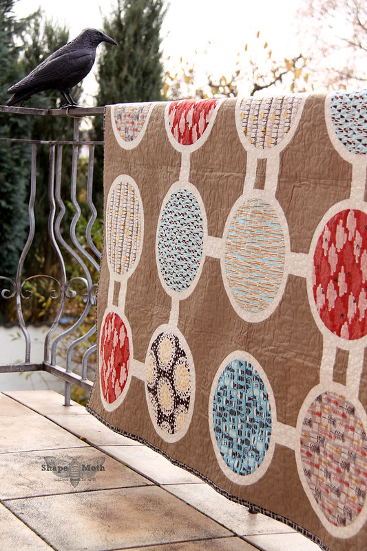
3 years ago I started with very traditional colour combinations. There were some japanese patchwork-inspired projects, lots of earth colours - browns, beiges, muted greens and yellows. Thinking about it, although I had (and spontaneously have) rushed towards more bold and strong colours, I somehow prefer harmonic and 'silent' colour palette. I'm not a huge fan of contrasting colour, not a fan of colour blocking also (however, like in everything, there are exceptions of rules; there are some really fabulous quilts that use completely 'not-mine' colours which I consider brilliant!).
What is important for me:
- That fabrics match when combined - how to explain it? I guess I can’t as that’s very individual thing. For me, certain colour/print combination will work nicely, for others they will not. It’s just the way the brain proceses the information.
- Colours - I drift towards 'muted' and 'silent' colours. I love nature and I highly value peace and silence in life. I guess it highly influences my designs.
- Fabric prints - I don't like combinations of busy fabrics in contrasting colours. I know that many modern quilters do use them but it's not for me. I tried to do it few times but my brain just doesn't 'see' those colours/prints combinations and I always end up with a mess instead of a nice quilt/block design.
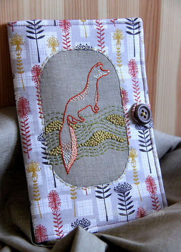
Here are my preferred colour choices/fabric combinations:
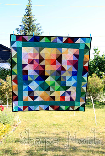
And here are more bold colours which I used. It's important to note, that those 2 below are not my original designs, but quilts based on a graphic or print which I found in the net. I really like the fabric/colour combination (hey, that's why I've sewn those quilts) but I wouldn't be able to create such colour combos on my own:
As to where I find my inspirations:
- First of all - fabrics. Colours and combination of colours in whole fabric lines. If I would to choose 3 fabric lines, which I consider the best (because of the colours used) I'd say: 'Cut out and keep' from Cloud9 Fabrics, 'Comma' by Zen Chic and 'Curio' by BasicGrey
- Quilts, graphics, prints. Eye candy which you find in the net. Tons of inspiration, new ways to combine colours, things, which normally I wouldn't try until I saw it somewhere.
- Architecture, billboards, advertisements in shops or patterns on things I (or people I see around) use like bags, boxes, clothes, etc.
- Nature - it has a huge impact on me, how I see world and I how I combine colours. Photos which you take on your holidays/trips/walks are a great colour inspiration (I guess most of you saw already an example of a photo with a colour palette made with it). I used the photo below to create a colour palette for the EPP pillow (which was published in the last Modern Patchwork issue!):
Thank you again Jess and thank to you all, who are visiting and reading!


6 comments:
Another great post. I love Joanna's blog! The colour palette pics is something I have found useful too when designing.
So fun to explore color. Love the projects and palettes
Thanks so much for this post!
I really want to do more color palette inspiration in my quilt design - always interesting to read how people approach color...I love it!
Fab post! Love nature inspired colour palettes!
Woohoo was so pleased to meet Joanna at FQR but you don't want to hear that Jess do you??
Your stress on compatibility of fabrics when combined, and your choice of soft and quiet colors show that you are deliberate in your work. The significance you give to fabric designs as well as your liking for avoiding busy combinations with contrasting colors underscore the distinct visual language you have carved out through quilting.
To embrace different tastes, consider looking into Bromelia Swimwear Coupon Codes for special offers on items which celebrate individual styles and unique expressions. Just like the way your quilts reflect your own sense of aesthetics, Bromelia Swimwear provides a variety of options that can cater for different preferences.
Post a Comment