Let us see shall we? So far we have learned about The Color Wheel and Color Terminology which included all that good stuff having to do with primary, secondary, and tertiary color (<-- tertiary, my personal fav color family). Then we became experts in combining color in Color Harmony and, not sure about you, but I certainly became a huge fan of this online color tool. Last week we learned about Color Context and I love how Jennifer described context as "knowing what colors do, when they are all cozying up to each other" as I think that is the perfect segway into talking about low volume which we will get to a little further down in this post.
But, before we jump to Low Volume, we need to chat about Value. Ready? Let’s do it…
VALUE
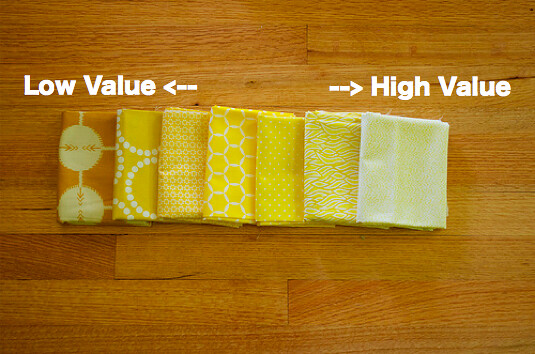
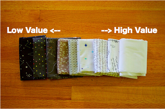
In artsy terms, value is what we are talking about when we describe a color as "light" or "dark". When we classify color as light versus dark we are describing its "brightness". To be geeky uber-technical about it...warning: feel free to gloss over this if you are anti-geeky uber-technical by nature...value (or brightness) is based on the amount of light eminating from the color. The more white the HIGHER the value, the less white the LOWER the value. The easiest way to think of this is using a grayscale. And of course this gives me an opportunity to use some fabric examples!
Of course the same value scale applies when we talk about any color... Such as yellow for example.

Value Challenges for Quilters
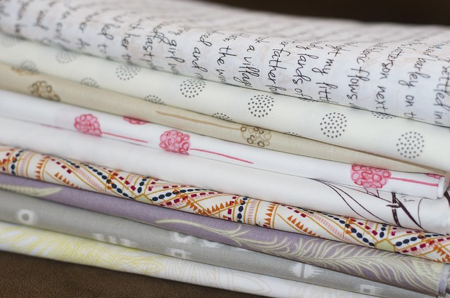
To apply this information to what We Do as Quilters we need to recognize the challenges that we face in our medium...in other words fabric. Painters, illustrators, graphic designers...pssht they've got it easy! Quilters often use patterned fabrics that combine multiple colors and sometimes multiple values all in one swatch. Depending on the scale of the fabric pattern if that swatch is cut in half the new swatch creates a change in value range. For anyone who has ever tried organizing their stash in color order you know you've faced the question of "hunh, well where does this one fit in?" The pile of fabrics I've depicted below demonstrates my "hunh" or "multicolored" fabric pile in my own stash.
To get past this challenge, my advice is to use the monochromatic feature on your camera or computer to judge the value of a particularly challenging fabric. I've done that here with the yellow example from above. You can see through grayscale how the patterns still have an important role in value.
Creating Contrast using Value.
Right. Okay, you get it, light versus dark, but why does this matter anyway? Value is important because it allows us to create contrast. If colors are close in value they will flatten, if they are varied in value then they will contrast and thereby create depth. Too close in value = flat. Far in value = depth. Take the yellows up above, looking at them in grayscale you can see that the fabrics closer together in color blend together and fall flat. But, I've taken the darkest yellow (low value) and the lightest yellow (high value) and paired them together below and now you can see the pop - value creating contrast.
This is example is also good because the darker yellow fabric has a lighter value pattern which, as you can see, also creates value contrast within the same piece of fabric! Quilters, we have so many options!
However, if you've diligently read through these Colour Theory Posts then you don't need me to tell you Value is merely one way to create contrast. Contrast can also be created with color through context as we learned in the last post. In fact, to push this even further, as fabric enthusiasts we all know contrast can also be achieved by contrasting different textures or fabrics with different scaled patterns. Oh fabric...how I love thee! Quick Example? Sure...
Value Contrast: As we've already seen above in the yellow, value contrast is an important consideration when pairing fabric. See how it works with these blue solids I paired. The depth is created by the range in the value. The value pairing creates an impressive contrast in the grayscale. This is why monochromatic pairings can often be so compelling.
Color Contrast : But as you already know complementary colors create a wonderful contrast as well and do not require a difference in value. Complementary colors = Blue and Orange. I kept the same blue from above but chose an orange with a similar value. While things look rather flat in the grayscale in color the fabrics vibrate against each other. And it follows that using complementary colors with different values results in a greater contrast.
LOW VOLUME
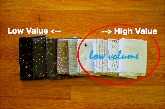
So why did I march you through the preamble about value and contrast above? Well...low volume of course! The trick to low volume is to consider value and how contrast is created in the ways I mentioned above such as color, pattern, scale, and value. If I were to tell you that all the fabrics above are considered low volume you may scratch your head and say what? If you have done any research into the recent low volume craze then you know that what is considered to be low volume covers a vast range. What is Low Volume?
To put it simply...low volume fabrics live in the high value range of the value scale. Nevertheless, one visit to the low volume swap flickr page demonstrates that there is a broad scope of what different quilters think of as low volume!
First and foremost, there is no "wrong way" to do low volume. Please, how ridiculous! However, after hosting two Low Volume swaps and fielding a multitude of questions on what qualifies as low volume I have found that low volume can be divided into two larger categories. Pop Low Volume and Muted Low Volume.
Pop Low Volume. Best described as graphic prints amidst a neutral background, usually white. This is the low volume style of Malka Dubrowsky who is credited with starting the concept of modern low volume in 2009 with an article she wrote for Quilting Arts magazine. This style is still very popular four years after that article was written. It is probably most commonly known in its implementation by Rita of Red Pepper Quilts. I describe it as "pop" because the design style utilizes the high value background of the fabric as a foundation to allow the graphic print to pop out. Place a number of these fabrics together in a quilt and voila you have a very cheerful, largely neutral quilt, with fun popping graphics playing against each other. TIP: If you gravitate towards this style of low volume look for fabrics with a large ratio of white, a single colored print or at the maximum a print composed of no more than two colors, and the simpler the pattern - the more graphic - the better.
Muted Low Volume. "If quiet had a color this would be it." - Sarah from Issabella the Cat's daughter when describing Sarah's low volume quilt. {Go check it out, Sarah's quilt features fabrics from the first Low Volume Fabric Swap hosted on my blog.} Muted low volume really is, well, muted! This style utilizes fabrics in soft colors found in the high value range such as light yellows, light purples, soft grays, tans. This style is not new to quilting as using muted low volume fabrics can be found in every period of American quilting. Today one source of its popularity amongst modern quilters can be attributed to the beautiful Sunday Morning Quilt featured in the pages of the book Sunday Morning Quilts. TIP: Thinking of putting together a muted low volume quilt? In addition to gathering fabrics in soft colors and muted tones also consider choosing fabrics with "soft patterns" such as florals, small dots, scripted text. Notice the bold chevron print above, in addition to the soft colors the pattern has a sketchy quality to it which softens the normally striking angles of the chevron. Smaller scale prints will work well in this low volume style but what works best is a combination of different prints paired together to add some interest to this type of low volume quilt.
No matter which style of Low Volume you prefer here is are some things to consider when picking your fabrics for your next low volume project...
Low Volume Fabric Considerations
- fabric with a large ratio of white or neutral
- consider the complexity of pattern
- minimal color contrast, a pattern with too many colors will distract from the neutral background
- color element, brighter/saturated color for pop low volume, soft colors for muted low volume
- rebecca lynne
Thanks so much Rebecca! Next week will be a series of guest posts from various quilters all about how they use colour and what inspires their colour choices.


Great article, helps clarify some of my thinking. I have also shared a link in the facebook group Quilt club Australia, so you might get a few new people looking at your blog.
ReplyDeleteActually I have enjoyed the whole series
What a carefully constructed and well written description of value and the ever-elusive low volume! In art school I had courses on color-theory of course, but this series has really helped to address certain lingering questions that I had about using color in a really purposeful way. I'll be bookmarking these for reference now and into the future!
ReplyDeleteThanks so much Jenelle!
DeleteThank so much for the info. You explained this really well!
ReplyDeleteGreat post! I have really enjoyed this series Jess, thanks for putting it together for us!
ReplyDeleteThis is very thoughtful and helpful, thank you!
ReplyDeleteVery clear explanation. Thanks! I love that camera trick :)
ReplyDeleteJessica I am addicted to that trick now, it really helps take the guesswork out!
DeleteAnother fabulous post in the series!
ReplyDeleteIt's a fabulously written and very helpful post - thanks, Becca!
ReplyDeleteSuch an informative post! Who knew that value =/ volume?! ;) Thanks, Jess + Rebecca!
ReplyDeleteHa! This subject always makes my head hurt, but I'm bookmarking this, because it's more useful than most of the things I've read trying to understand this concept :) Thank you for the post!
ReplyDeleteI find it fun to look online and see the different versions of low volume that people pick for swaps and such. I gravitate towards low volume with low saturation. That's why it's fun to join the swaps and have my low volume horizons expanded.
ReplyDeleteGreat description, which I think summarises why I avoid the LV swaps, I like the muted, neutral toned ones only really, if I'm trying to get an LV background, I'll add other things to really pop :o)
ReplyDeleteReading this for the first time. Well done. I plan to go back and read the other posts when I get a chance. Thanks for the series.
ReplyDeleteFab post! I love reading about color theory.
ReplyDeleteHi Jess!
ReplyDeleteI know this blog post is oooooold, but I remembered it from back in the day and hunted it down to share with the Maine Modern Quilt Guild, since they are discussing low volume fabrics on their Facebook page. I notice now that a good number of the photos from this post are no longer active. Is there any easy way to fix them, or is this just too old of a post to share now? I hope you're well! <3 Kitty